Asia Union Airlines
The rebranding of Asia Union Airlines was a large-scale and strategically significant project. Through the joint efforts of our team and the airline’s specialists, a comprehensive process was developed, covering positioning, brand values, and its long-term development strategy.
Briefing
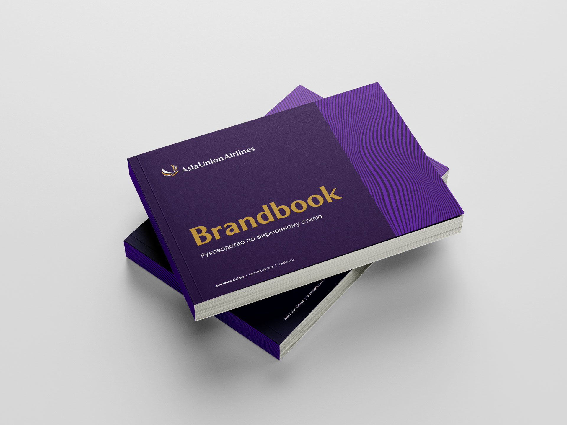
The ultimate goal of the rebranding was to create a cohesive and competitive brand that reflects the airline’s mission and values. The new image emphasizes reliability, dynamism, and strategic development. The brand strengthens trust among clients, partners, and employees.
Asia Union Airlines
Rebranding
Brand Design, Rebranding
Business goal
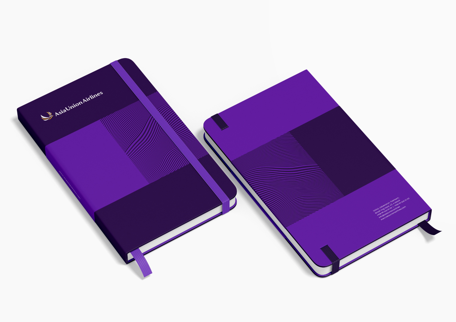
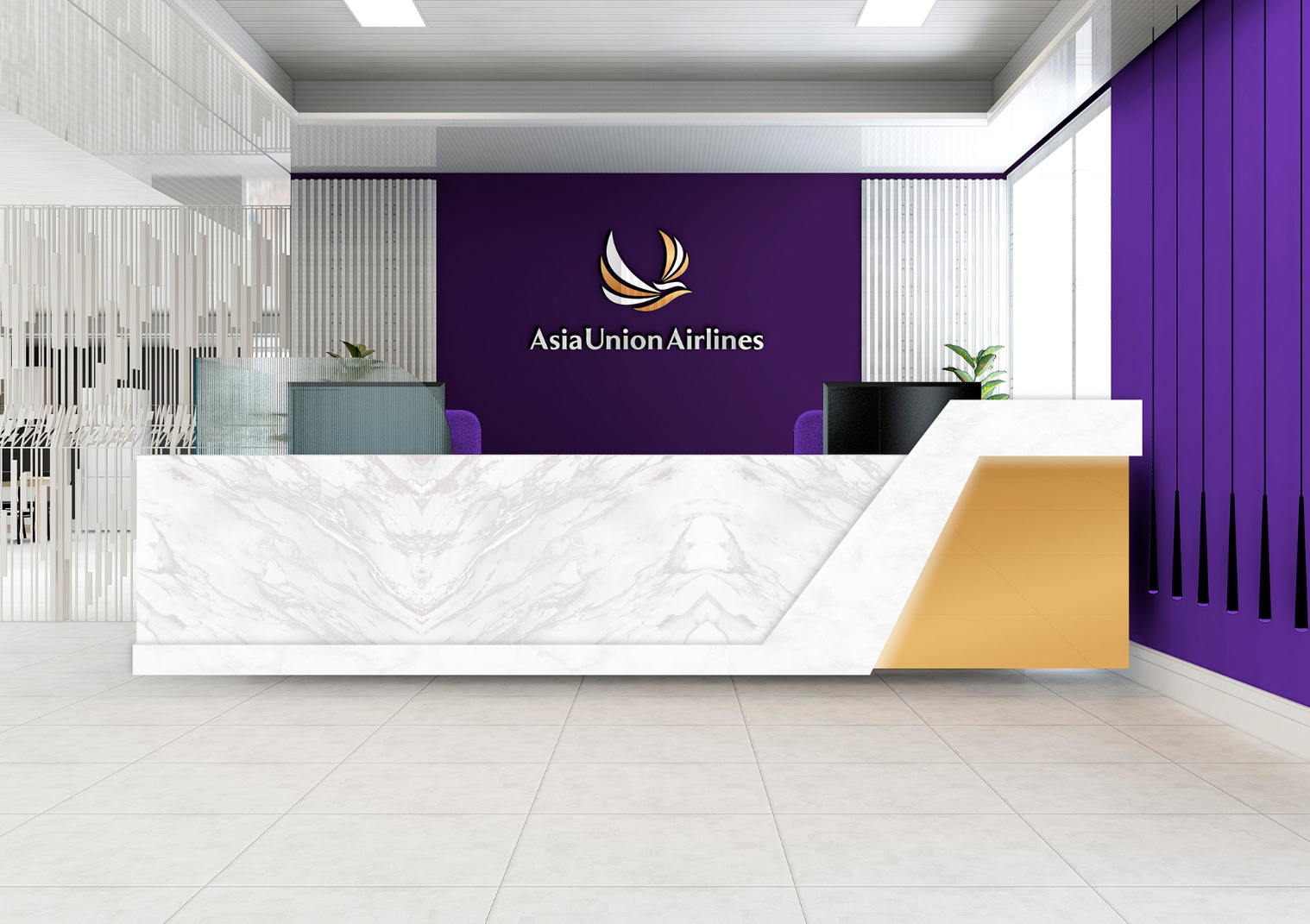
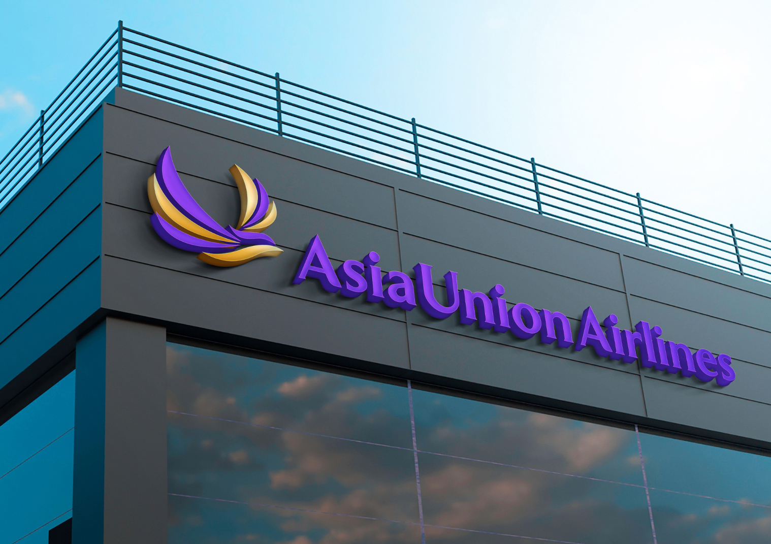
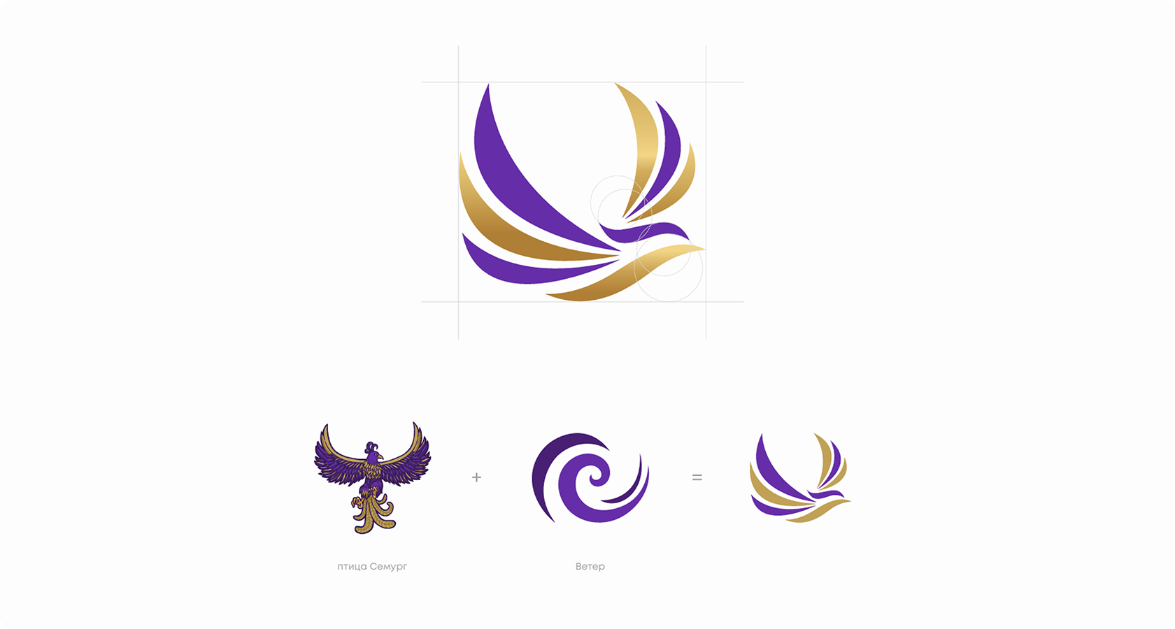
The brand mark is a shortened and versatile version of the logo, adapted for various applications. It is constructed on a strict modular grid, maintaining precise proportions and branded spacing. At the core of the mark lies an abstract image of the mythical bird Semurg. The flowing lines symbolize wind, speed, and airspace. The bird cutting through the airflow conveys the idea of movement and overcoming boundaries. The mark creates the image of a dynamic, stable, and evolving aviation brand.
Product Description
The rebranding of Asia Union Airlines reflects the company’s strategic development and its transition to a new stage of growth. The brand shapes the image of a modern passenger airline focused on the market of the Republic of Uzbekistan. At the core of the concept are reliability, flight regularity, and a high level of service. The company is focused on high-demand destinations such as Turkey, the UAE, and Saudi Arabia. Asia Union Airlines aims to meet the growing demand for both passenger and cargo transportation.
Development process
development
The rebranding of Asia Union Airlines was aimed at creating a strong and competitive airline brand. The main objective was to strengthen audience trust and establish a modern strategic positioning.
The new logo reflects the airline’s reliability, dynamism, and growth. The visual solution emphasizes the brand’s modern identity and its connection to the aviation industry.
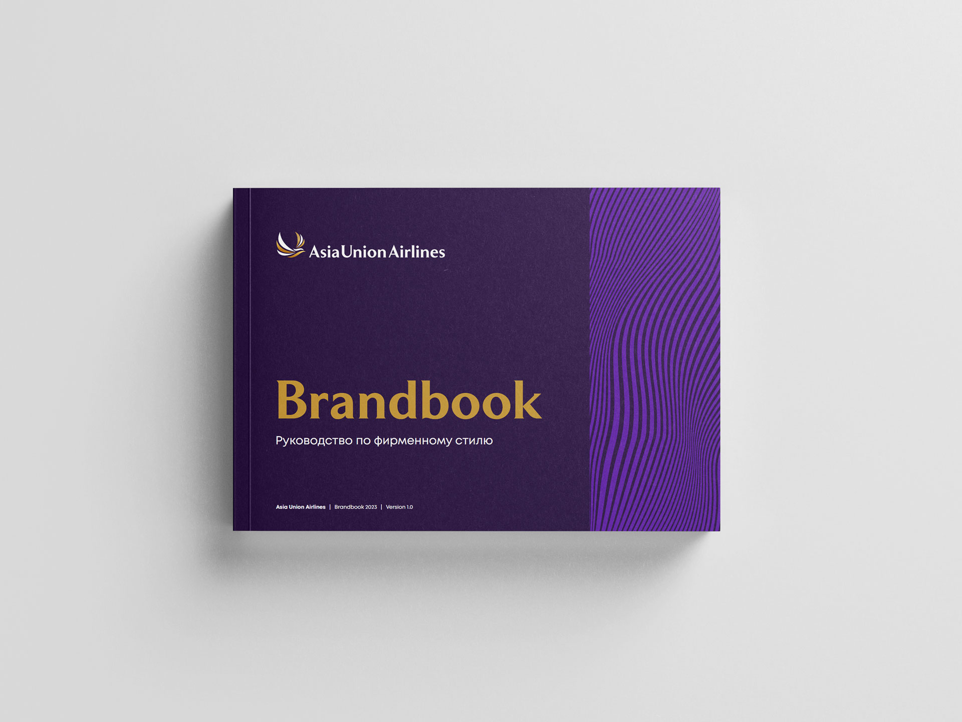
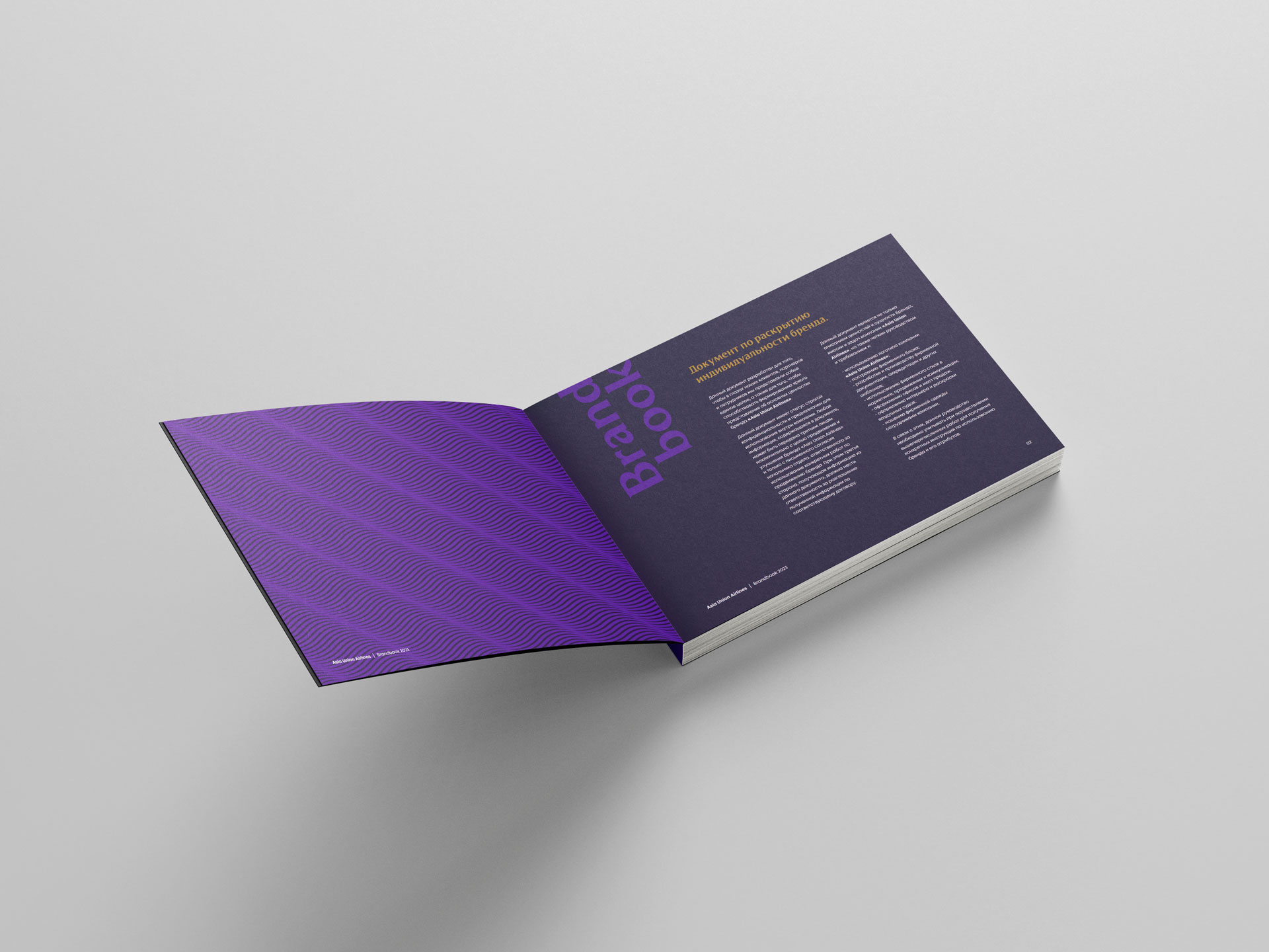
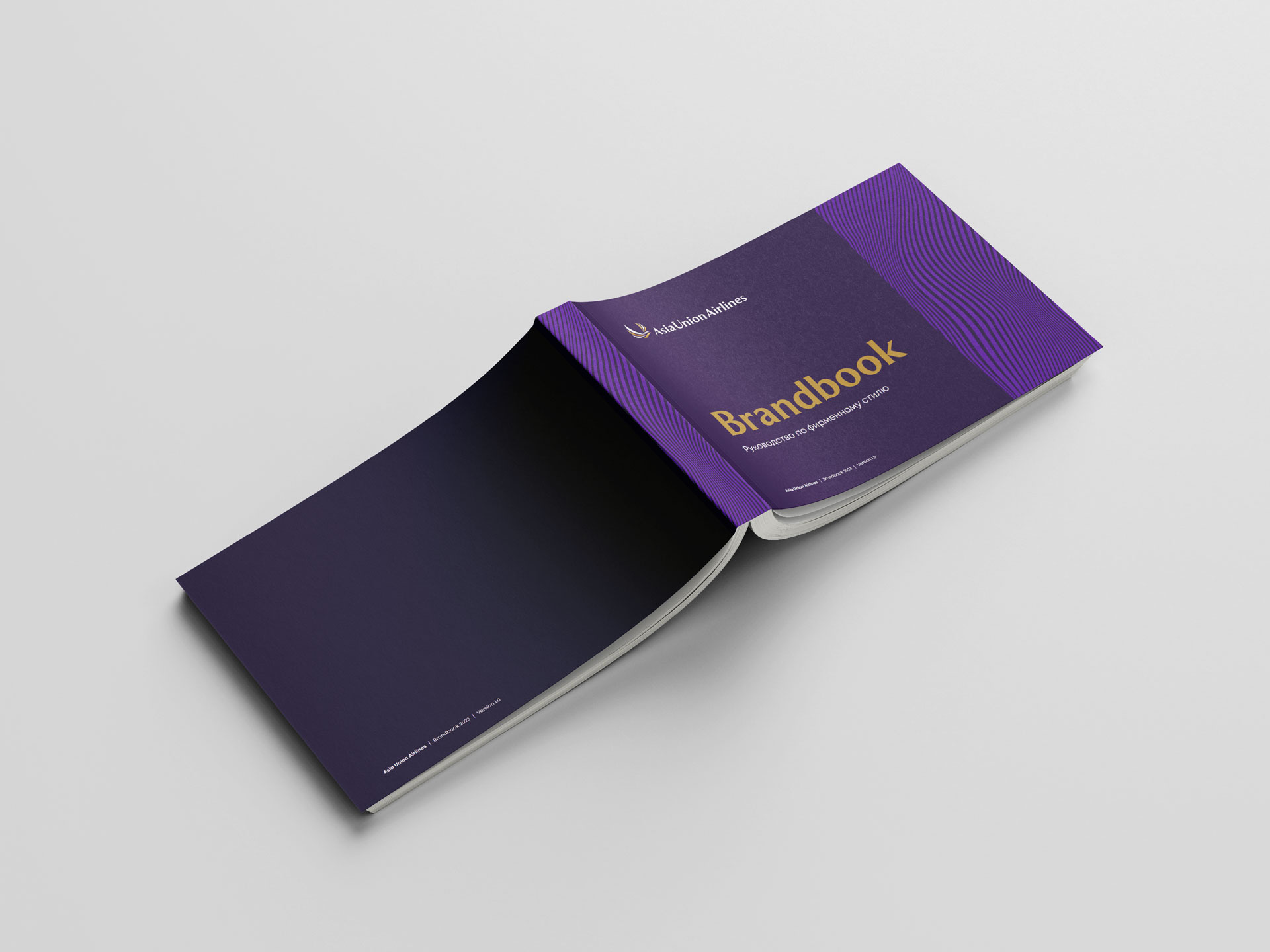
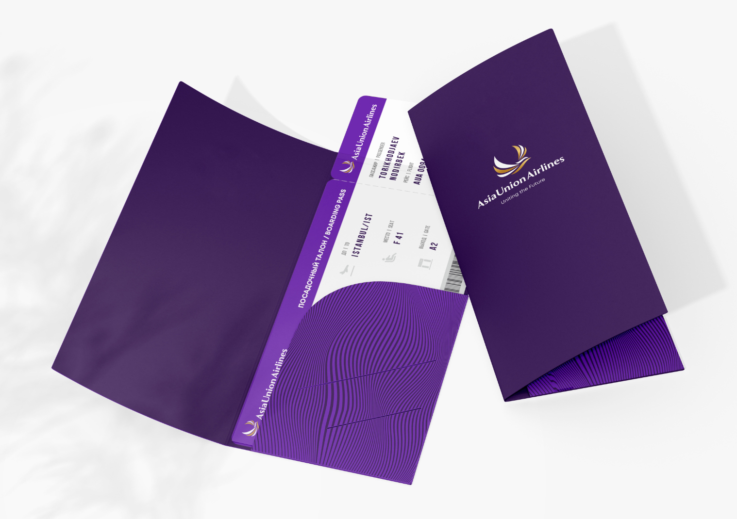
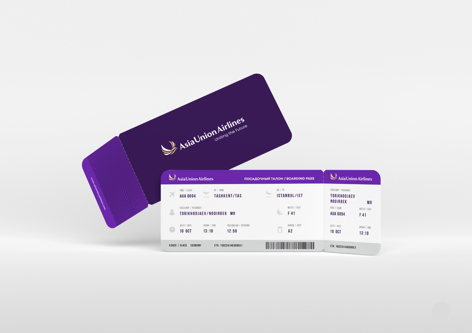
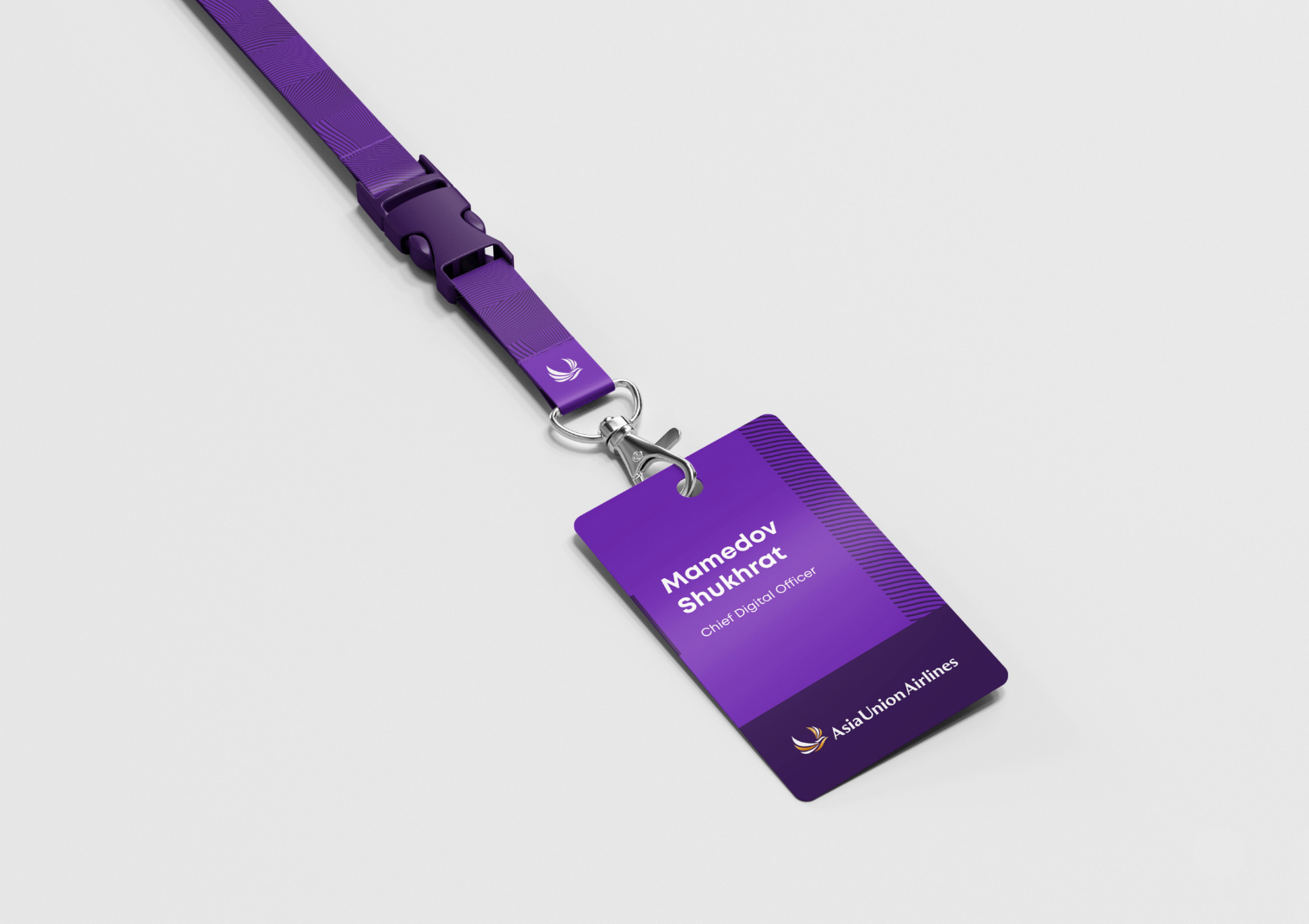
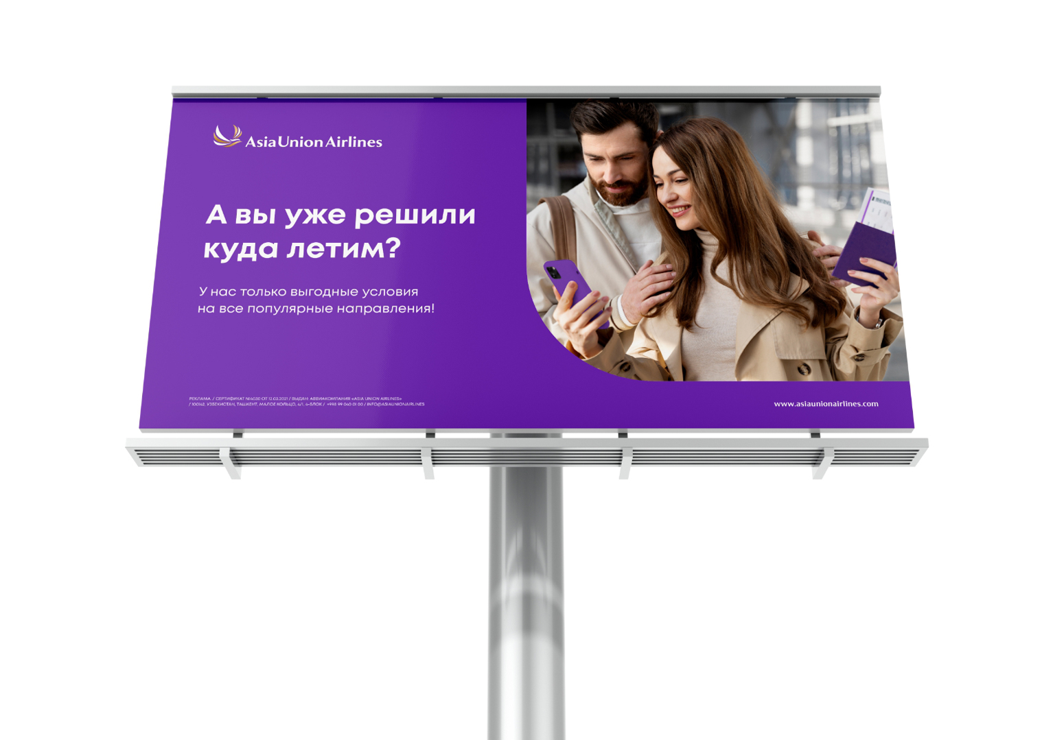
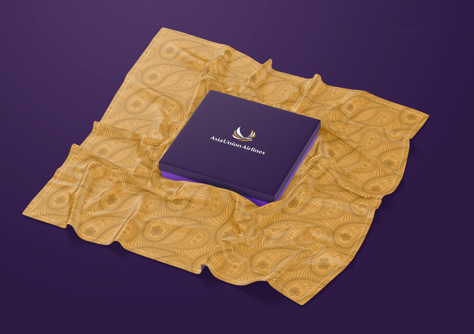
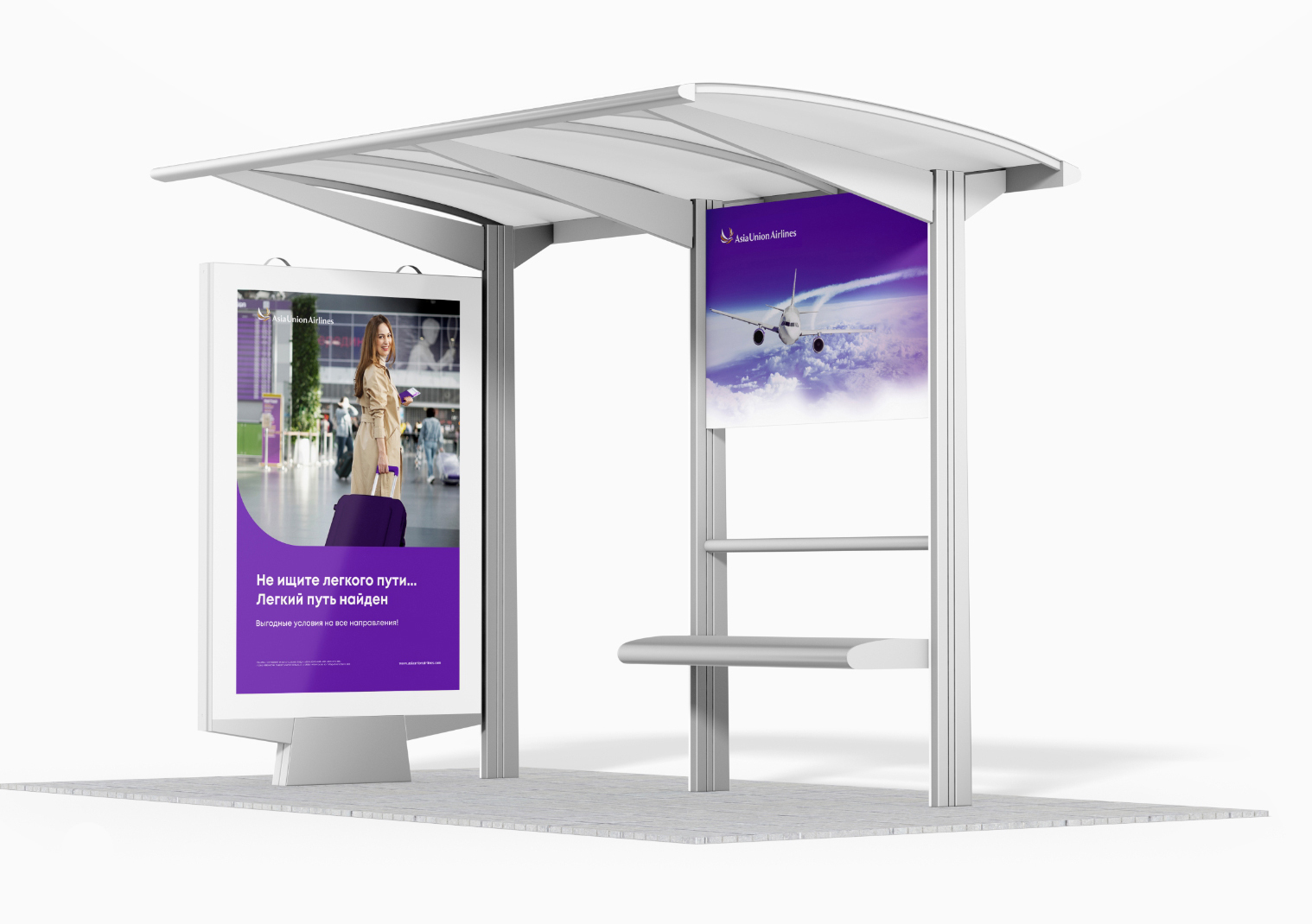
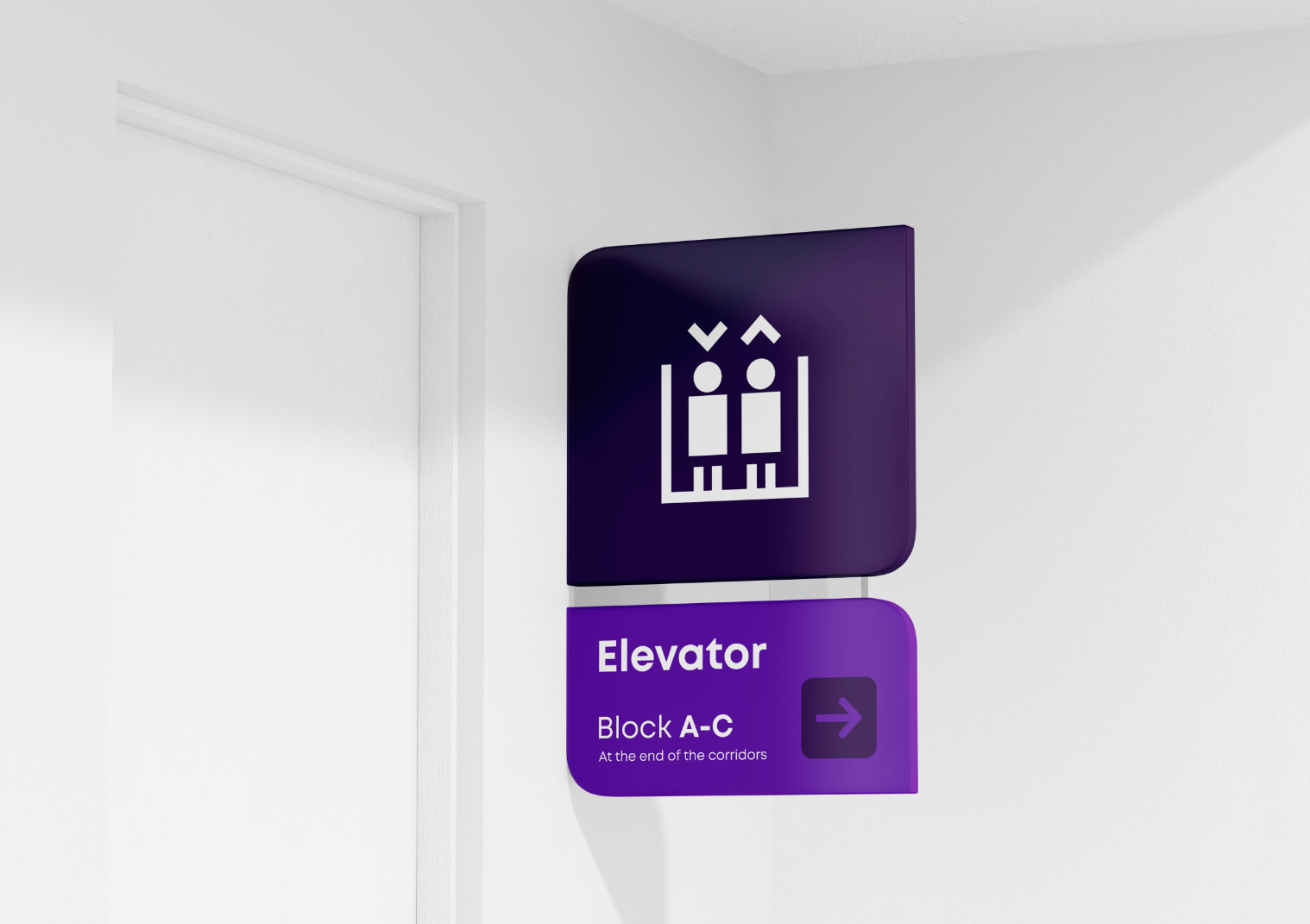
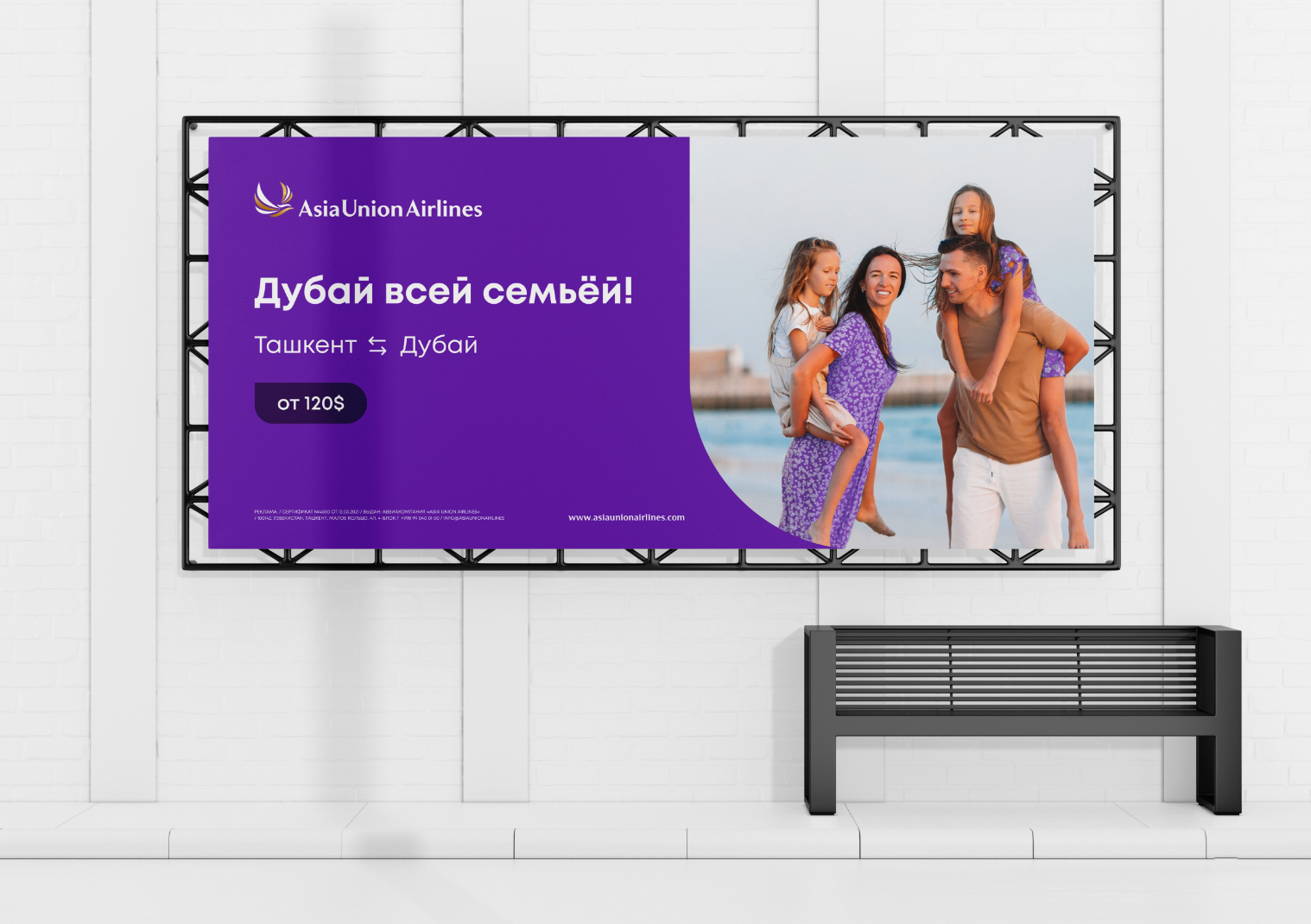
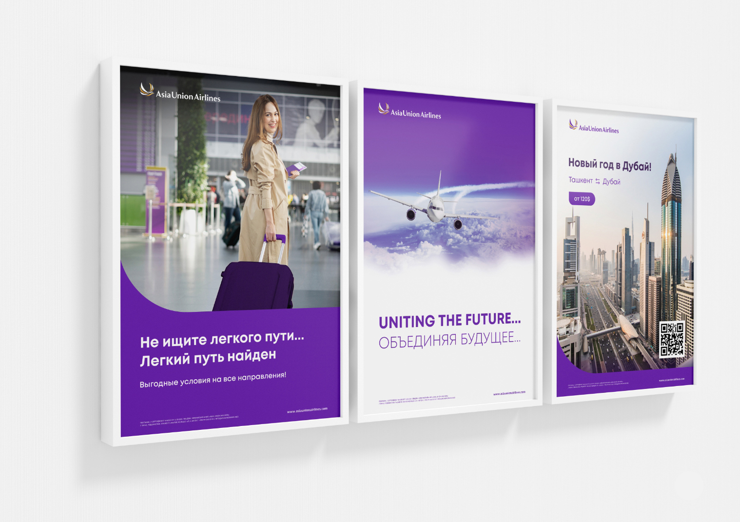
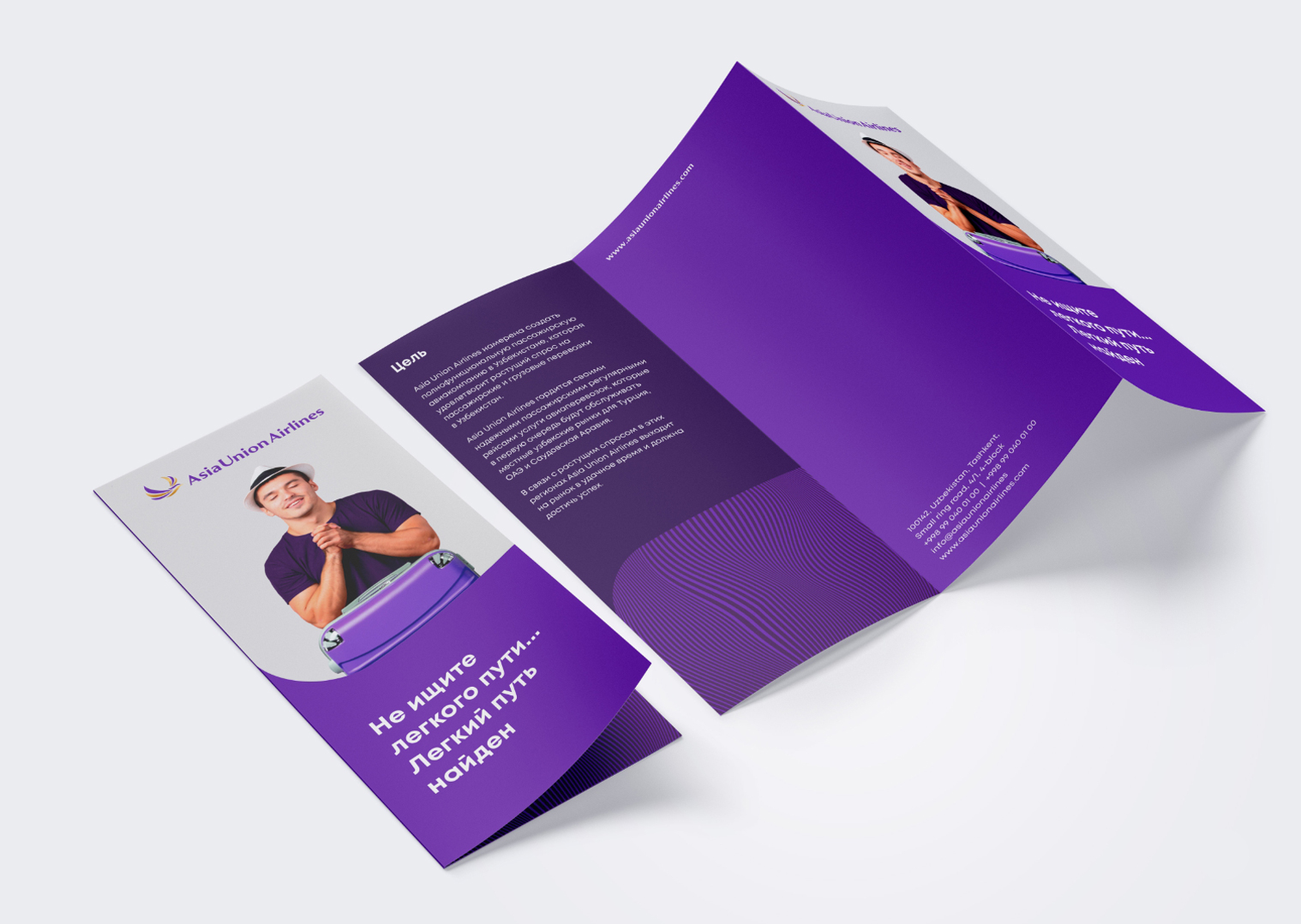
The design of advertising materials, digital platforms, and branded assets was developed. The new style ensures brand recognition across all audience touchpoints.
The brand’s communication is built around the values of reliability, safety, and dynamic growth. This helps strengthen the airline’s reputation and increase customer loyalty.
Website design